
Introduction
Neutral colors are the unsung heroes of the design world. Often seen as mere background players, these shades can actually take center stage when used effectively. From creating serene, minimalist spaces to providing the perfect backdrop for bolder hues, neutral colors are versatile and timeless. In this article, we’ll explore the magic of neutral colors, how to use them, and why they remain a staple in both fashion and interior design.
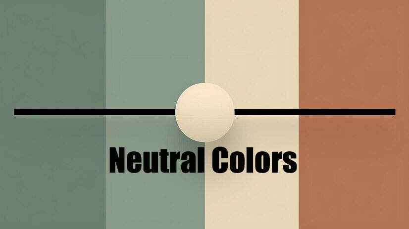
What Are Neutral Colors?
Neutral colors are shades that lack strong chromatic content. They include whites, blacks, grays, and browns, as well as more subtle shades like beige, taupe, and ivory. These colors are often used to create a balanced and harmonious look, providing a versatile foundation that complements any color palette.
The Importance of Neutral Colors in Design
Versatility
Neutral colors can seamlessly blend with any other color, making them incredibly versatile. Whether you’re aiming for a modern, rustic, or classic look, neutrals can adapt to any style.
Timelessness
Unlike trendy colors that come and go, neutral shades are timeless. They provide a lasting appeal that won’t look outdated after a few years, making them a wise investment for any design project.
Serenity and Calm
Neutral tones create a calming and serene environment. They are perfect for spaces where you want to relax and unwind, such as bedrooms, living rooms, and offices.
Types of Neutral Colors
Whites
White is the ultimate neutral color, symbolizing purity and cleanliness. It’s often used to make spaces look larger and more open. Variations like off-white and ivory add a touch of warmth.
Blacks
Black adds depth and sophistication. It’s bold and dramatic, often used for accents and creating contrast in design. Charcoal and slate are softer alternatives that still offer a strong presence.
Grays
Gray is the epitome of neutrality, balancing between black and white. It’s a versatile shade that can be warm or cool, depending on the undertones. Popular shades include dove gray, slate, and pewter.
Browns
Brown brings warmth and earthiness to a space. It ranges from light tan to deep chocolate, providing a cozy and inviting atmosphere. Shades like taupe, mocha, and chestnut are commonly used in both interiors and fashion.
Beige
Beige is a light brown color with a soft, warm feel. It’s a popular choice for creating a neutral background that complements both warm and cool color schemes.
Taupe
Taupe is a blend of brown and gray, offering the best of both worlds. It’s a sophisticated color that adds depth without overpowering other elements in the design.
Ivory
Ivory is a warm white with a hint of yellow. It’s softer and more subdued than pure white, adding a touch of elegance and warmth to any space.
How to Use Neutral Colors in Interior Design
Creating a Neutral Base
Start with a neutral base for your walls, floors, and large furniture pieces. This creates a blank canvas that you can build upon with other colors and textures.
Layering Textures
To prevent a neutral space from looking flat, incorporate various textures. Use materials like wood, metal, fabric, and glass to add depth and interest.
Adding Accent Colors
While neutrals are the foundation, accent colors bring personality to the space. Choose bold colors for pillows, artwork, and accessories to create focal points and add vibrancy.
Balancing Warm and Cool Neutrals
Mixing warm and cool neutral tones can create a more dynamic and balanced look. For example, pair a warm beige sofa with cool gray throw pillows.
Neutral Colors in Fashion
Classic Elegance
Neutral colors are synonymous with classic elegance. A little black dress, a crisp white shirt, or a tailored gray suit are wardrobe staples that never go out of style.
Versatile Wardrobe
A wardrobe built on neutral pieces offers endless versatility. Neutral clothing can be mixed and matched effortlessly, allowing for a multitude of outfit combinations.
Accessorizing with Neutrals
Neutral accessories like shoes, bags, and belts are timeless and can complement any outfit. They also provide a balanced look when paired with colorful or patterned clothing.
Seasonal Transitions
Neutral colors transition seamlessly between seasons. Light neutrals like ivory and beige are perfect for spring and summer, while darker shades like charcoal and chocolate are ideal for fall and winter.
Psychology of Neutral Colors
Calming Effect
Neutral colors have a calming effect, reducing stress and creating a serene environment. This makes them ideal for spaces where relaxation and focus are essential.
Sophistication and Luxury
Neutrals, especially shades like black, gray, and taupe, evoke a sense of sophistication and luxury. They are often associated with high-end, minimalist design.
Balance and Stability
Neutrals provide a sense of balance and stability. They ground a space and create a cohesive look, making them essential for achieving a harmonious design.
Common Mistakes to Avoid with Neutral Colors
Overusing a Single Shade
Using too much of one neutral color can make a space look monotonous. Balance different neutrals to create depth and interest.
Ignoring Undertones
Pay attention to the undertones of neutral colors. Mixing warm and cool undertones can clash and disrupt the harmony of the space.
Lack of Contrast
Incorporate contrast to avoid a flat look. Use darker neutrals for accents or mix different textures to add dimension.
Case Studies: Successful Use of Neutral Colors
Interior Design
Many renowned interior designers use neutral palettes to create timeless, elegant spaces. For example, the Scandinavian design style heavily relies on neutral tones to achieve its minimalist, cozy aesthetic.
Fashion Icons
Fashion icons like Coco Chanel and Giorgio Armani have championed neutral colors, emphasizing their timeless elegance and versatility. Their designs continue to influence modern fashion.
Branding and Marketing
Brands like Apple and Chanel use neutral colors in their branding to convey sophistication, simplicity, and reliability. This strategy helps them maintain a strong and timeless brand identity.
Conclusion
Neutral colors are far more than just background players. They offer versatility, timelessness, and a calming influence, making them an essential part of both interior design and fashion. By understanding how to use neutral colors effectively, you can create spaces and styles that are elegant, balanced, and enduring. So, embrace the power of neutrals and let them transform your designs into timeless works of art.
FAQs
What are neutral colors?
Neutral colors are shades that lack strong chromatic content, such as whites, blacks, grays, and browns. They are versatile and can complement any color palette.
Why are neutral colors important in design?
Neutralcolors provide a timeless and versatile foundation for any design, creating a balanced and harmonious look. They are also calming and can enhance the overall aesthetic without overpowering other elements.
How can I use neutralcolors in my home?
Start with a neutral base for walls and large furniture, then layer textures and add accent colors for depth and interest. Mixing warm and cool neutrals can create a more dynamic look.
Are neutralcolors good for fashion?
Yes, neutralcolors are timeless and versatile in fashion. They form the basis of a classic wardrobe and can be easily mixed and matched with other pieces.
What is the psychology behind neutralcolors?
Neutralcolors have a calming effect and evoke sophistication and luxury. They provide a sense of balance and stability, making them ideal for creating serene and harmonious environments.